Exciting news! Edge Solutions is announcing an updated brand identity, including a new logo, colors, font, and website. You’ll begin to see the new Edge logo on our website, building signs, social media, and more – everything has been updated to reflect the new look and feel of Edge Solutions. While the look is new, the values of the company remain the same. We believe this new look better encompasses the company we have become over the past 10 years, as well as where we are headed in the years to come.
Since our founding in 2008, we have stuck with the original edge “swoosh,” complete with our signature green color. Over the last ten years, the company has changed dramatically. From expanding into new territories, hiring on new skillsets, and the full transformation into a next-generation systems integrator, we felt the time was right to update our brand. But don’t fret – we’re still featuring our signature green color!
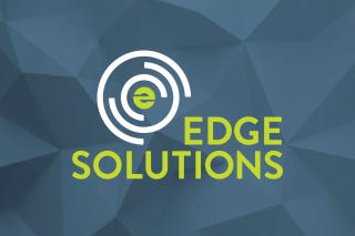
Our goal was to create a logo that was clean, modern and representative of the organization. A sleek slate blue now compliments the timeless green while simultaneously evoking feelings of trust and security. We’ve succeeded in creating an icon that stands on its own to represent the organization, without needing the company name beside it.
The vortex on the left represents the vortex of activity and change within our industry. If you look closely, you will notice that the logo’s center combines the company’s initials – “ES” – in one clever symbol created to represent Edge at the center of the vortex, embracing change and helping clients navigate the ever-evolving technology landscape.
We hope you like this new look and feel for Edge Solutions. While the look of the logo and website has changed, we remain the same Edge – the same people, values, and commitment to our clients that we embodied with the green swoosh. New look, same Edge.